
What is VariSwatch?
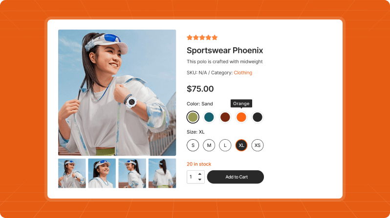
VariSwatch is a WooCommerce add-on that turns the default “Choose an option” dropdowns for product variations (like Color or Size) into clickable visual swatches. Instead of a plain dropdown, customers see colored circles, product images, labeled buttons, or checkboxes — making it faster and more appealing to pick a variation.
Who is it for?
Any store owner running WooCommerce who sells variable products (products with multiple colors, sizes, materials, styles, etc.) and wants to improve how those options appear on the product page and in the shop.
Requirements
- WordPress 6.0 or higher
- PHP 7.4 or higher
- WooCommerce installed and active
- At least one variable product with attributes (e.g. Color, Size)
Installation
Install the plugin
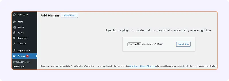
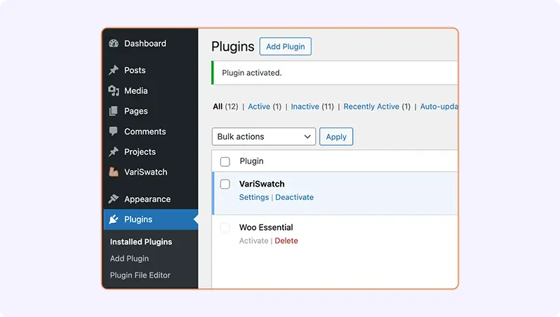
- In WordPress admin, go to Plugins → Add New → Upload Plugin.
- Upload the
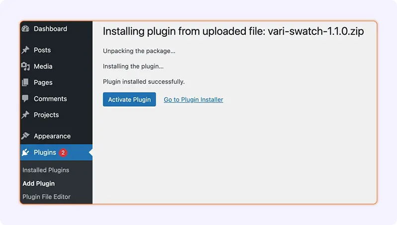
vari-swatch.zipfile and click Install Now. - Click Activate.
After activation, a new VariSwatch menu item appears in the WordPress sidebar.
Activate your license (optional/premium)
If you are using the licensed version:
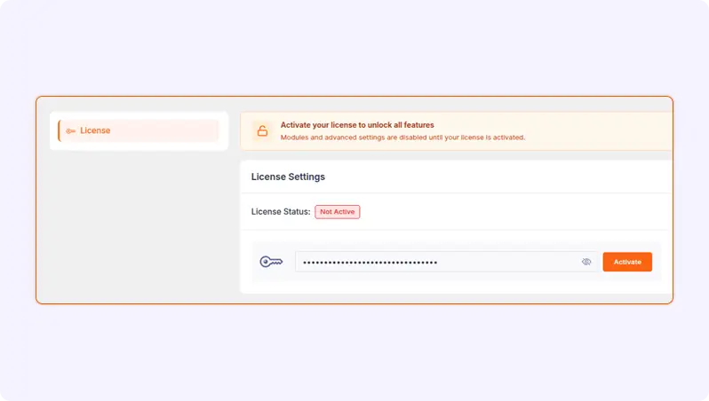
- Go to VariSwatch → Settings → License.
- Paste the license key you received.
- Click Activate.
Once the license status shows as Valid, all premium options on the Modules page are unlocked.
Getting Started
Open the VariSwatch dashboard
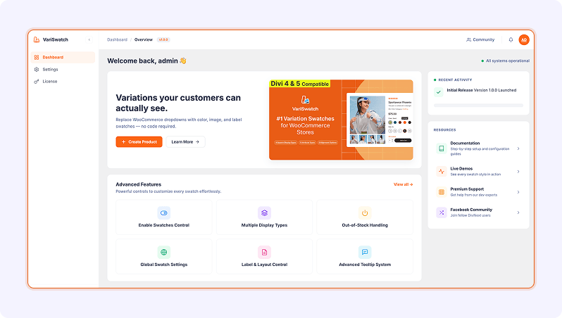
From the WordPress admin sidebar, click VariSwatch. You will land on the Dashboard page with:
- A welcome banner
- Feature highlights
- Quick links to Documentation, Live Demos, Support, and the DiviNext community
- Recent activity and promotional cards
From here, use the left sidebar to move to Variation Swatches, Modules, and Settings.
Enable swatches for the first time
By default, VariSwatch does not render anything on your storefront until you enable it. To turn it on:
- Go to VariSwatch → Variation Swatches.
- Stay on the General Settings tab.
- Turn on Enable for Product page (single product pages).
- Turn on Enable for Shop/Archive (shop, category, tag pages).
- Choose a Display type (Button, Radio, Select, or Checkbox).
- Click Save Settings at the top right.
Visit any variable product on your storefront to see the swatches in action.
Preparing Your Products
VariSwatch works on top of WooCommerce’s standard attribute system. Before you see swatches, each attribute term (e.g. the specific color “Red”, or size “Large”) needs visual data — a color, an image, or a tooltip.
Create a product attribute
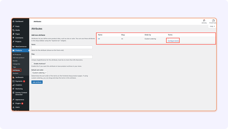
- Go to Products → Attributes.
- Enter a Name (e.g.
Color) and a Slug (e.g.color). - Click Add attribute.
Add terms with swatch data
- Next to your attribute, click Configure terms.
- Click Add new Color (or whatever you named it).
- Fill in the standard fields (Name, Slug, Description).
- Fill in the VariSwatch fields that appear below:
- Color — Pick a hex color using the color picker.
- Image — Upload or choose an image from the media library.
- Tooltip Type — Choose No Tooltip, Text Tooltip, or Image Tooltip.
- Tooltip Text — Custom text shown on hover (only if type is Text).
- Tooltip Image — Custom image shown on hover (only if type is Image).
- Click Add new Color.
Repeat for every term. On the attribute list screen, VariSwatch adds Color, Image, and Tooltip columns so you can see at a glance what each term has.
Assign attributes to a product
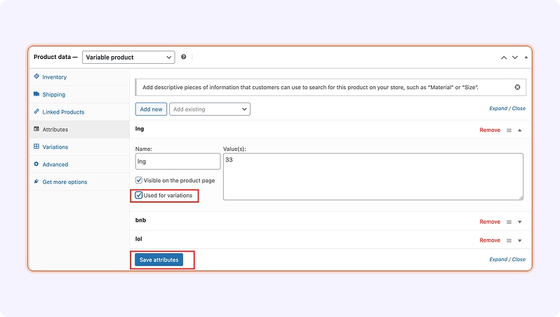
- Edit a Variable product.
- Under Product data, choose Variable product from the dropdown.
- Go to the Attributes tab and add your attribute.
- Tick Used for variations and choose the terms.
- Click Save attributes.
- Go to the Variations tab and create variations (or use Create variations from all attributes).
- Set price/stock for each variation and Update the product.
Using the VariSwatch Dashboard
The admin interface is split into four main pages, accessed from the left sidebar inside VariSwatch.
Dashboard page
A landing page with:
- Welcome message and system status
- Shortcut to Create Product
- Cards for key features
- Links to Documentation, Demos, Support, and the Facebook community
- Recent activity (release info)
- Cross-promotional products and a Rate us on Trustpilot card
Use this page as your jump-off point.
Variation Swatches page
The main configuration screen, organized into three tabs:
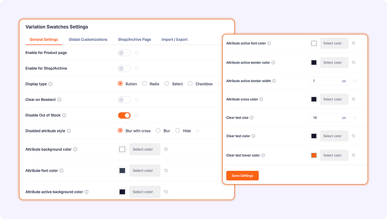
- General Settings — turn on/off the plugin, choose display type, handle out-of-stock behavior, colors, sizes, tooltips, and label layout.
- Global Customizations — store-wide appearance controls (colors, borders, tooltip design).
- Shop/Archive Page — options specific to shop/category/tag listing pages.
Every field has a small InfoTip icon — hover it for a short explanation. Each row also has a Reset button to restore that single field to its default.
Click Save Settings (top right) to apply changes. A green toast “Settings saved successfully!” confirms the save.
Modules page
Shows advanced/premium swatch modules. If the plugin is not licensed, this page is locked behind an Unlock Now overlay that sends you to the License page. Once licensed, all modules are editable.
Settings page
- License — paste, show/hide, activate, deactivate, or remove your license key. Also shows current status (Valid / Invalid).
- Any future global settings are grouped here.
Configuring Swatches
All of the following options live on VariSwatch → Variation Swatches.
General Settings tab
Enable for Product page
Toggle. Shows swatches on single product pages when ON.
Enable for Shop/Archive
Toggle. Shows swatches on shop, category, tag, and custom product archive pages when ON.
Display type
Choose how swatches look by default:
- Button — Labeled rectangular buttons (best for sizes, materials).
- Radio — Circular color/image swatches (best for colors and visual options).
- Select — A styled custom dropdown (replaces the WooCommerce dropdown but still feels familiar).
- Checkbox — Checkbox-style multi-select look.
Clear on Reselect
Toggle. When ON, clicking an already-selected swatch deselects it.
Disable Out of Stock
Toggle. When ON, variations that are out of stock render as disabled swatches that can’t be clicked.
Disabled attribute style
Choose how disabled swatches look:
- Blur with cross — Swatch is blurred and a cross is drawn over it.
- Blur — Swatch is blurred only.
- Hide — Swatch is removed from view entirely.
Attribute colors
- Attribute background color — Background for Button and text swatches.
- Attribute font color — Text color for Button and Radio swatches.
- Attribute active background color — Background when the swatch is selected.
- Attribute active font color — Text color when selected.
- Attribute cross color — Color of the cross line used for disabled swatches.
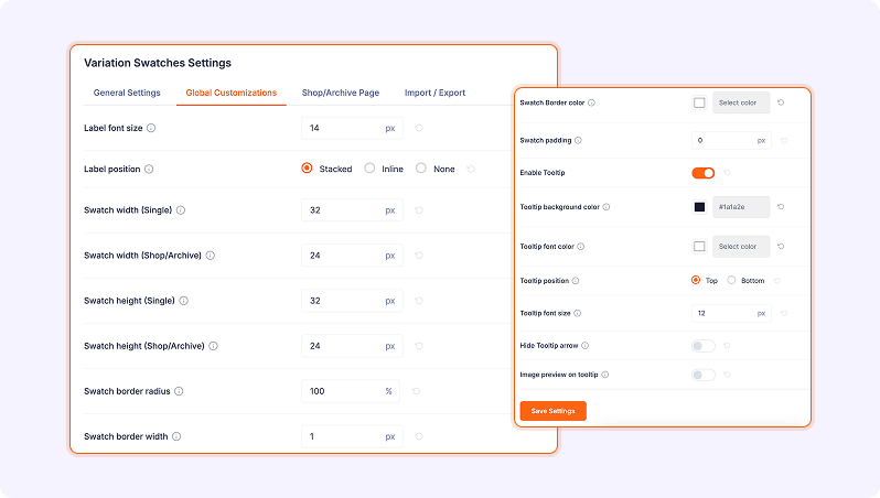
Label font size
Numeric px value for the attribute label (e.g. “Color:”) font size.
Label position
- Stacked — Label sits above the swatches (default).
- Inline — Label sits to the left, swatches to the right.
- None — Hide the label entirely.
Swatch sizing
- Swatch width / height (Single) — Size on single product pages (default 32 × 32 px).
- Swatch width / height (Shop/Archive) — Size on shop and archive pages (default 24 × 24 px).
Swatch border
- Swatch border radius — 0 to 100%.
100gives a perfect circle/pill;0gives a square. - Swatch border width — Border thickness in pixels.
- Swatch Border color — Color picker for the border.
Enable Tooltip
Toggle. When ON, tooltips appear on swatch hover. Expands additional tooltip fields:
- Tooltip background color
- Tooltip font color
- Tooltip position — Top or Bottom.
- Tooltip font size — px value.
- Hide Tooltip arrow — hides the small pointer.
- Image preview on tooltip — shows the variation image inside the tooltip on hover.
Global Customizations tab
This tab groups store-wide appearance controls. Everything saved here applies to both single-product and shop/archive pages. Typical controls include colors, borders, typography, and tooltip design shared across the whole plugin.
Shop/Archive Page tab
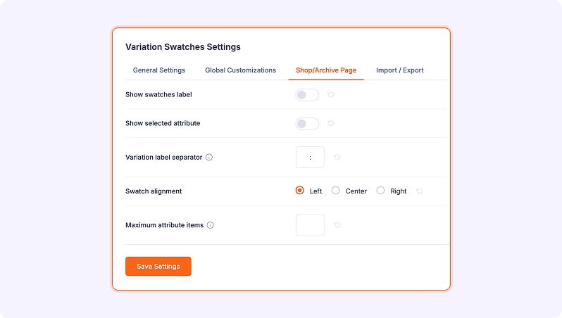
Options that only apply to listings:
Show swatches label
Toggle. Show or hide the attribute label (e.g. “Color:”) above shop/archive swatches.
Show selected attribute
Toggle. Display the currently-selected option’s text next to the swatches.
Variation label separator
A character placed between the label and the value. Default is : (e.g. Color:).
Swatch alignment
Align swatches to the Left, Center, or Right of the product card.
Maximum attribute items
Numeric. Limits how many swatches are visible per attribute on listings. Extras collapse into a +N counter. Leave empty for no limit.
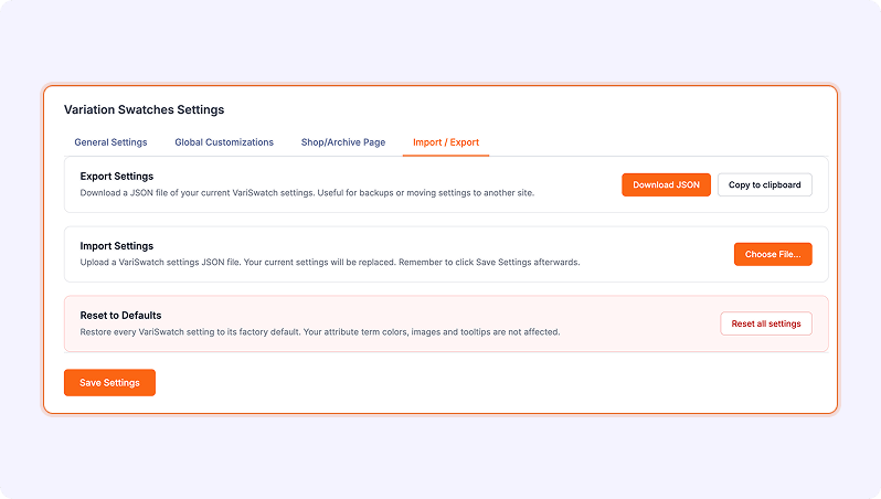
Import / Export Settings
The Import / Export feature allows you to easily back up your Variation Swatches settings or transfer them between different websites.
Export Settings
You can export your current settings as a JSON file for backup or migration purposes.
- Click Download JSON to download a file containing all your current settings.
- Alternatively, click Copy to Clipboard to copy the settings data instantly.
This is useful when:
- Migrating settings to another site
- Keeping a backup before making major changes
Import Settings
You can import previously saved settings using a JSON file.
- Click Choose File and upload your JSON settings file
- After uploading, click Save Settings to apply the changes
⚠️ Note: Importing settings will overwrite your current configuration.
Reset to Defaults
If needed, you can restore all settings to their original default values.
- Click Reset all settings to revert everything back to default
👉 This will reset all plugin settings, but attribute term colors, images, and tooltips will remain unchanged.
Final Step
After making any changes (import or reset), don’t forget to click:
Save Settings
Tooltips in Depth
Tooltip types per term
On the attribute term edit screen, choose a Tooltip Type:
- No Tooltip — Nothing shows on hover (except for Radio/Checkbox swatches, which always show the term name).
- Text Tooltip — Shows the Tooltip Text you entered (falls back to the term name if empty).
- Image Tooltip — Shows the Tooltip Image you uploaded.
Global tooltip controls
Under Variation Swatches → General Settings → Enable Tooltip, you can adjust appearance globally: background, text color, position, font size, arrow visibility, and whether to use the variation image as a hover preview.
Best practices
- Use image tooltips for patterned fabrics, finishes, or prints where color alone isn’t enough.
- Use text tooltips for short descriptive labels (“Soft Cotton Blend”).
- Keep tooltips short — long text may wrap awkwardly.
Working with Out-of-Stock Variations
Enable the behavior
Turn on Disable Out of Stock in General Settings.
Choose an appearance
Set Disabled attribute style to match your branding:
- Blur with cross — emphasizes unavailability.
- Blur — subtle, keeps the design clean.
- Hide — removes unavailable swatches completely.
Cross color
If you use Blur with cross, set Attribute cross color to match your theme. It defaults to #1a1a2e (near-black).
Typical Workflows
Set up a color swatch for a clothing store
- Create a Color attribute (
Products → Attributes → Color). - Add terms: Red, Blue, Green — pick hex values with the color picker, and optionally upload a swatch image (fabric close-up).
- Set each term’s Tooltip Type to Text Tooltip and write a short hover label.
- Create/edit a variable product, tick Used for variations on the Color attribute, and generate variations.
- In VariSwatch → Variation Swatches, enable both toggles and choose Radio display type.
- Set Swatch border radius to
100for round circles and choose an accent color for Attribute active background color. - Save and preview on the storefront.
Show size buttons instead of a dropdown
- Create a Size attribute with terms: S, M, L, XL (no color/image needed).
- Set their Tooltip Type to No Tooltip.
- In VariSwatch → Variation Swatches, set Display type to Button.
- Adjust Attribute background color and Attribute active background color to match your theme.
- Save.
Speed up shop-page selection
- Enable Enable for Shop/Archive.
- On the Shop/Archive Page tab, turn on Show swatches label and Show selected attribute.
- Set Maximum attribute items to
5so cards stay compact. - Align swatches to Left or Center to match your product grid.
Troubleshooting
Swatches don’t appear
- Make sure Enable for Product page (or Enable for Shop/Archive) is turned on and you saved the settings.
- Confirm the product is a Variable product and has at least one attribute with Used for variations checked.
- Confirm each term has a Color or Image if you expect visual swatches.
- Clear any caching plugin / CDN cache.
Swatches show, but no color circles
The term has no Color saved. Edit the attribute term (Products → Attributes → Configure terms) and set a hex color in the Color field.
Tooltips don’t show
- Ensure Enable Tooltip is ON.
- The term’s Tooltip Type must be set to Text or Image (not No Tooltip).
- If using Image Tooltip, make sure Tooltip Image is uploaded.
Out-of-stock variations still clickable
- Turn on Disable Out of Stock in General Settings.
- Make sure the variation itself is marked as Out of stock (or has stock = 0) in the product’s Variations tab.
Styles look broken after a theme change
Some themes override WooCommerce variation markup heavily. Try toggling Display type to Select to confirm the underlying logic works, then adjust colors and sizes on the Global Customizations tab to match your new theme.
“Unlock Now” overlay blocks the Modules page
The plugin needs a valid license. Go to Settings → License, paste your key, and click Activate.
Frequently Asked Questions
Does VariSwatch work with any WooCommerce theme?
Yes. VariSwatch hooks into standard WooCommerce filters and replaces the variation dropdown, so it works on Storefront, Astra, Divi, Blocksy, GeneratePress, and most other themes. Styling may need light tweaking on heavily customized themes.
Do I have to add a color AND an image?
No. You can use just a color, just an image, or both. If both are present, the chosen Display type determines what is rendered.
Can I have different swatch sizes on product vs shop pages?
Yes. Use Swatch width/height (Single) and Swatch width/height (Shop/Archive) — they are configured independently.
Will my existing WooCommerce dropdowns still work?
Yes. VariSwatch hides the native <select> element but keeps it in the DOM so the standard Add to cart and variation-matching logic keeps working. If you disable VariSwatch, your site falls back to the default dropdown.
Is it translation-ready?
Yes. The plugin loads its text domain vari-swatch from the /languages/ folder, and all strings are translatable via .po/.mo files.
Where can I get help?
- Documentation: https://variswatch.com/docs/
- Live demos: https://demo.variswatch.com/
- Premium support: https://divinext.com/support/
- Community (Facebook): https://www.facebook.com/groups/divinext
Uninstalling
Deactivate
Go to Plugins → Installed Plugins, find VariSwatch, and click Deactivate. Your settings remain stored in the database so you can reactivate later without reconfiguring.
Delete
After deactivating, click Delete. WordPress runs the plugin’s uninstall.php routine, which removes plugin files. Attribute term data you created (colors, images, tooltip settings) stays in the database with the taxonomy terms — if you remove VariSwatch permanently, those term meta fields simply become inactive.
Appendix — Quick Reference
Admin menu map
| Menu item | What it does |
|---|---|
| VariSwatch → Dashboard | Welcome, feature highlights, resources |
| VariSwatch → Variation Swatches | Enable + configure all swatch appearance |
| VariSwatch → Modules | Premium modules (requires license) |
| VariSwatch → Settings | License key + global plugin settings |
Attribute term fields
| Field | Purpose |
|---|---|
| Color | Hex color shown on color swatches |
| Image | Image shown on image swatches |
| Tooltip Type | No Tooltip / Text Tooltip / Image Tooltip |
| Tooltip Text | Hover label (when type is Text) |
| Tooltip Image | Hover image (when type is Image) |
Display types at a glance
| Type | Best for |
|---|---|
| Button | Sizes, labels, materials |
| Radio | Colors, visual styles |
| Select | Stores preferring a dropdown feel |
| Checkbox | Multi-option visual feel |
Save / Reset
- Click Save Settings (top right of Variation Swatches page) to persist changes.
- Click the Reset icon next to any field to restore its default.
Enjoy a better WooCommerce variation experience with VariSwatch.